ChowNow: Business Manager
Restaurant staff were drowning in inefficient order workflows during peak hours. Here's how I transformed ChowNow's tablet experience to cut order processing time and reduce staff stress?
The restaurant POS market grows at 6.44% annually toward $30.7B by 2035, with players like Toast showing 32% growth in multi-unit customers by offering integrated solutions. By updating this point of sales system, we introduced BYOD capability, allowing restaurants to use their own iPads instead of proprietary hardware, reducing operational costs. With 22K+ restaurants, relying on ChowNow for order management, tablet experience directly impacts restaurant operations in an increasingly competitive market.
Output: ChowNow can save $500 per location and yield retention
Overview
40 million orders are accepted annually through the ChowNow tablet, but the tablet itself has not been touched in 10 years. As engineering updates the code to Swift UI in order to add features, we took opportunity to add our evolving design system, increase usability, and planned for scalability.

Problem
Goal
Redesign the tablet for an easier experience across desktop/tablet/mobile
Project Objective
Understand what improvements to make to tablet experience
Research future needs for the roadmap and planning for product scalability
Create and explore immediate and future design needs
Create a new tablet design system that aligns with the current design system
Business Problem
High risk of disrupting the daily workflow of our restaurants
The current model does not allow restaurants to download the application on their own tablet which causes restaurant owners to have to pay a monthly fee for the tablet and manage multiple devices
Reports of the clunky design causes restaurant staff to miss their food orders
Research
Both exploratory research and user testing was conducted at the same time to expedite the process.
On this page, I will mostly touch upon user testing as it’s more relevant to the direct output of this product. To see the exploratory research, you may view here.
Design
Activities included:
Design Audit
Competitive Analysis
Initial Design
User Testing on Initial Design
There was an extra step that confused users
Add photo
Our company prided itself in the large font size, but restaurant staff preferred to see entire order
Add photo
Our company prided itself in the large font size, but restaurant staff preferred to see entire order
Design
Initial Designs
Creating the initial designs, I was unsure if the sizing and visual design made sense, so I tested a few of the key designs in UserTesting with restaurant staff and shared with our engineer team to understand the design constraints.
Add photos
Balancing the iOS system
As I was designing on an iOS system, I needed to use certain iOS icons and navigations and balance this with our ever evolving ChowNow branding system and icons. I created new tablet design system that was complementary with our desktop and mobile design system.
Add photos
Pilot & Learnings
Pre-Pilot Research
6 concept tests via User Testing
2 design workshops with 6 lead customer service representatives
During-Pilot Research
4 pre-usability tests
11 restaurant visits
150+ pilot communications
9 surveys via Survey Monkey

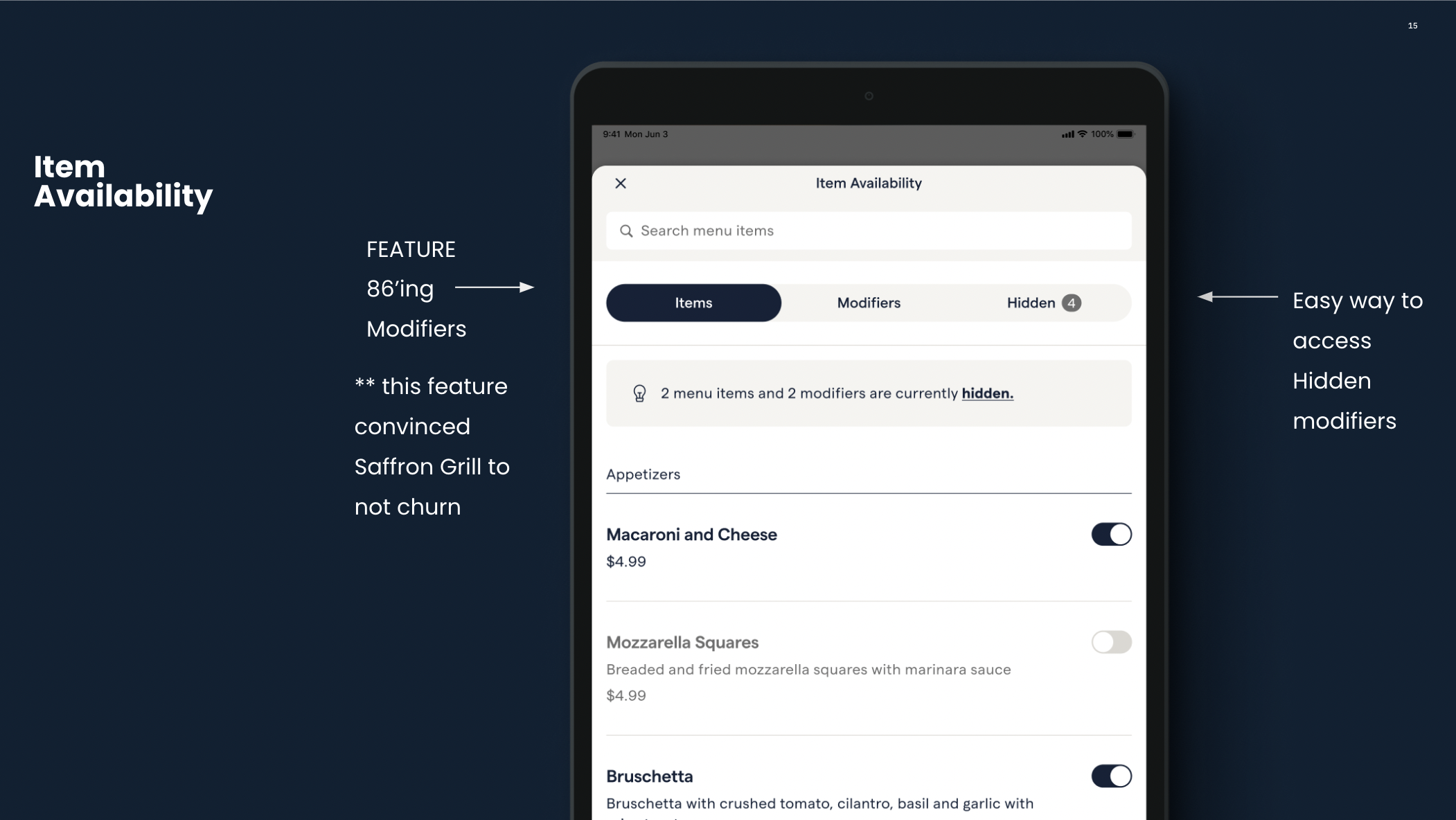
Usability Issues Discovered in the Pilot Version (redesign)
Staff missing orders due to the clunky design
Users perceived “Refunds” not working; but we discovered they were not hitting the final refund option because it was hidden
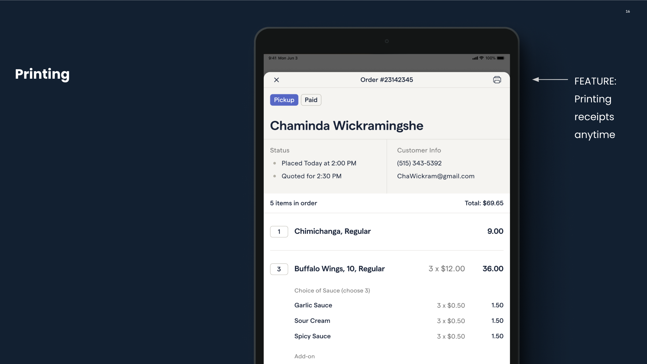
Caught printing and receipt issues that caused 5% of restaurant to stop using the new pilot experience.
Different preferences in text size.
Often time the way an order is counted does not reflect the receipt and can cause confusion

Balancing the iOS system
As I was designing on an iOS system, I needed to use certain iOS icons and navigations and balance this with our ever evolving ChowNow branding system and icons. I created new tablet design system that was complementary with our desktop and mobile design system.
Content Design
I carefully went through different content options for navigation and buttons. For example, our typical go back “cancel” button would not work in this scenario because it could be misconstrued as canceling the order.
Pilot
In the beginning I designed fast and scrappy with limited feedback, basing many decisions on a design audit and looking at usability enhancements. As were were building the product, we wanted to make sure we ran a pilot to catch current issues but also this is a critical product, our goal was to make sure we had user feedback. I created a list of pilot candidates and reached out to relevant restaurants based on past survey responses, feedback, and recommendations from the Restaurant Success Team. We were able to install 50 pilot versions in restaurants, and found critical bugs and usability issues during the beta testing. I kept in constant communication with our restaurants and quickly worked with our engineer team to communicate issues and resolutions.
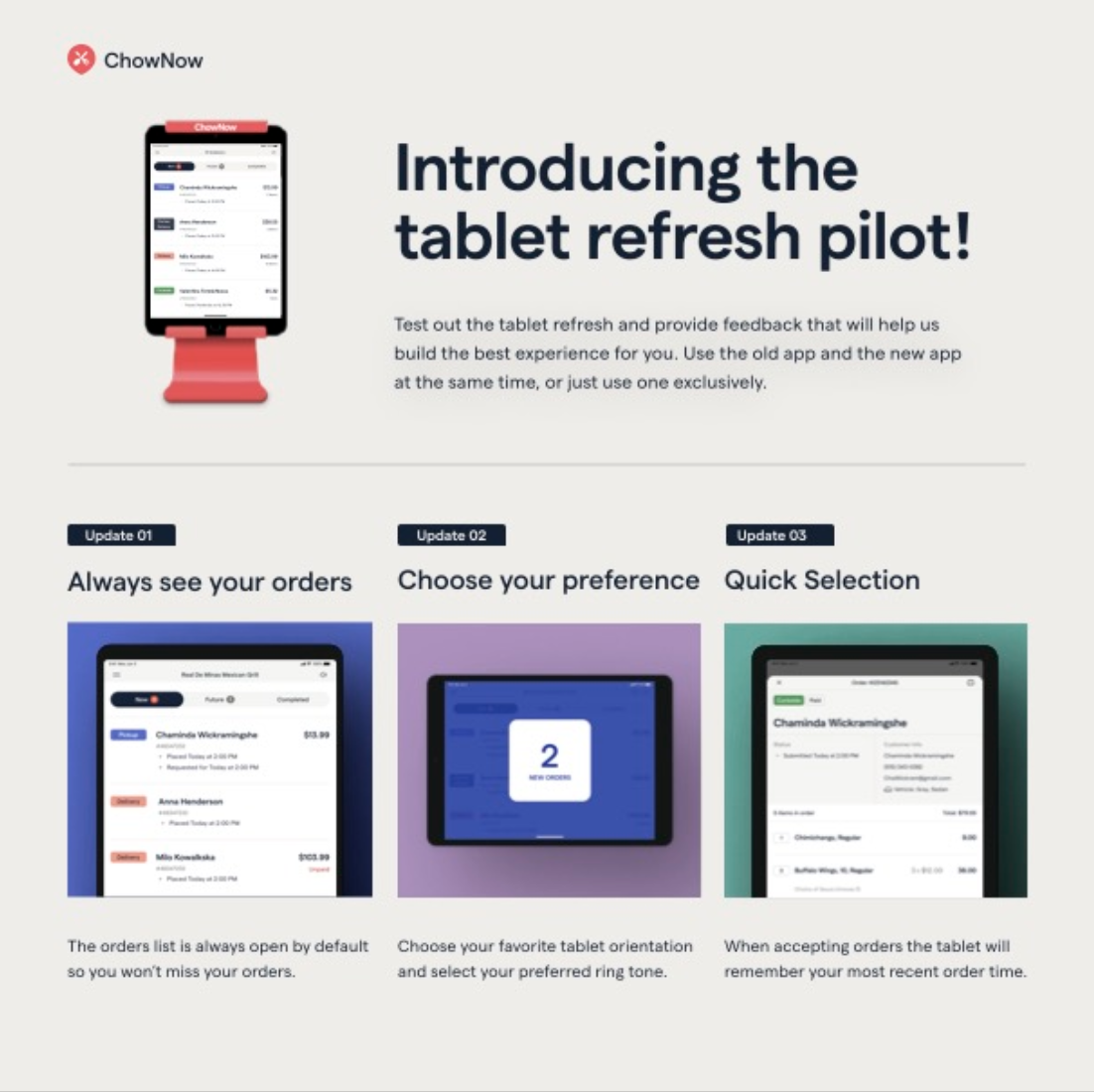
Snapshot of Key Features
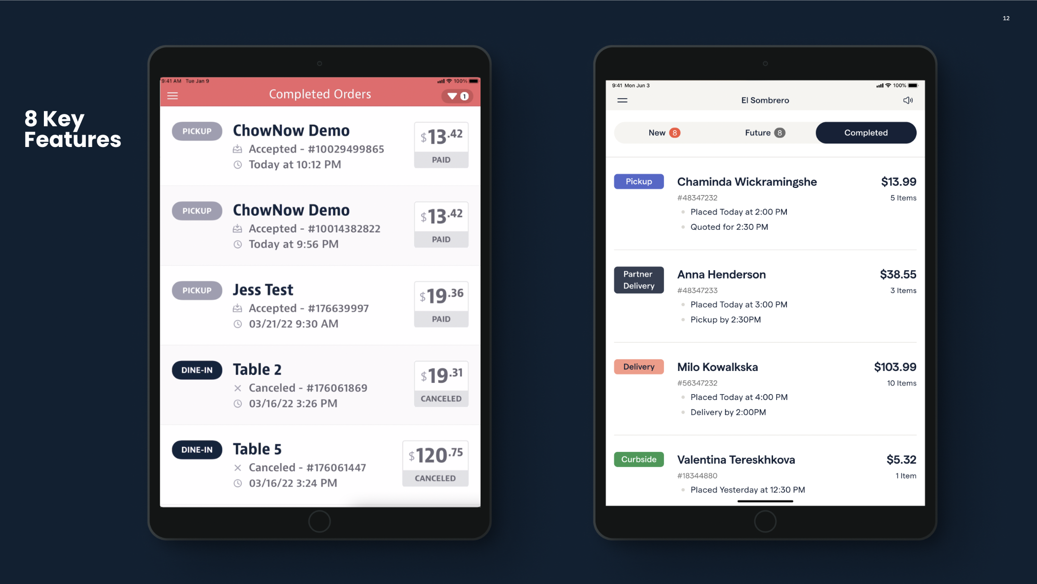
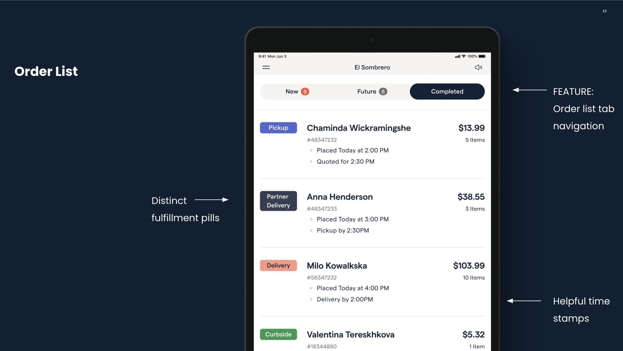
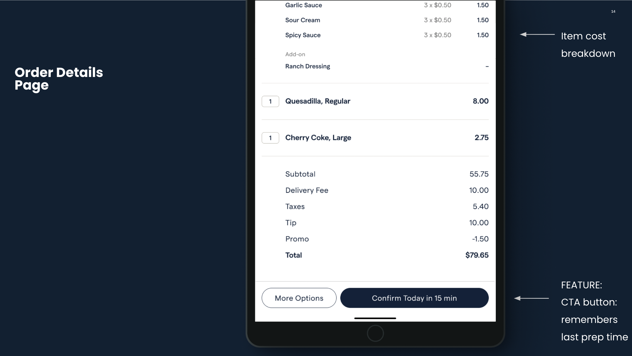
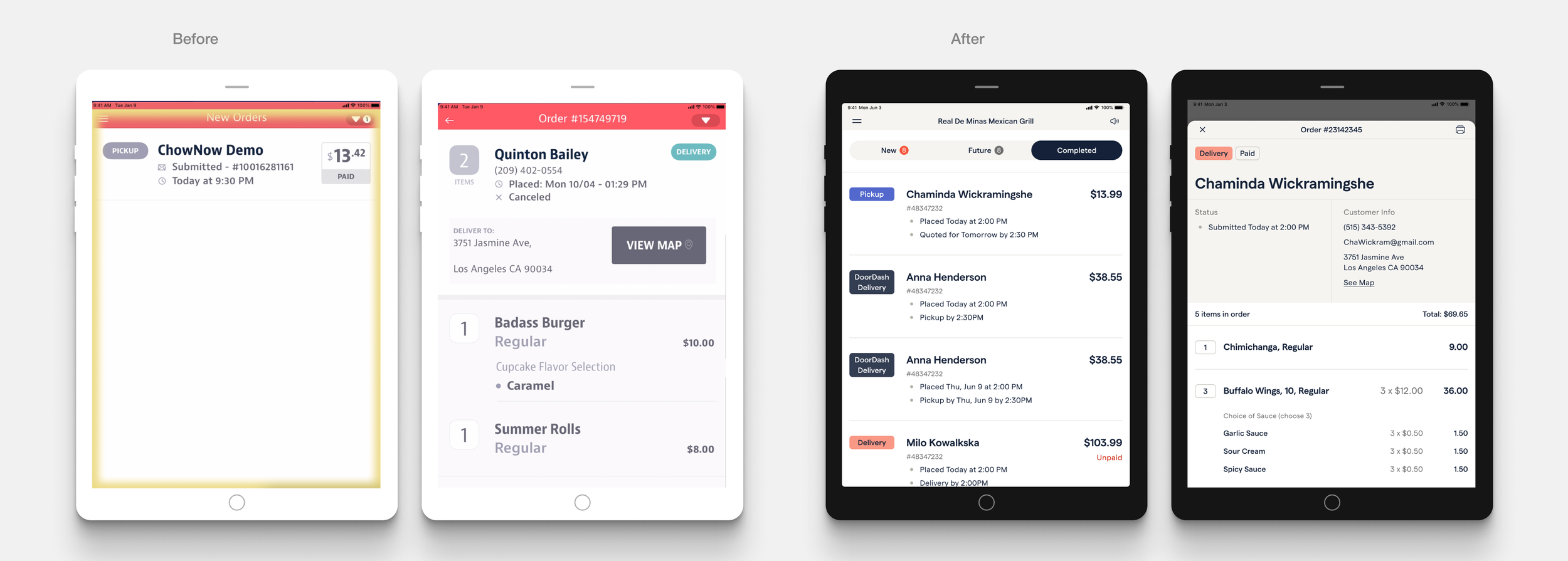
Order List
When new orders came in previously users needed to pull down a drawer and accept orders to see them, which caused missed orders
I redesigned the page so that all orders on one page
Users preferred an overview of the order list rather than large font size. I reduced the font size, but our engineer implemented the option to allow font size to scale accordingly through iOS settings.
Order List
I divided the page into three different functional categories and added a notification for easy visibility into new orders
Color-coded different order fulfillment types for quick recognization
Added helpful time stamps, when an order is placed, when it is suppose to be picked up by, helps users understand how much time they have to prep an order.
Adjusted the date format (For example, 3/15/23 - to Today / Tomorrow) to reduce mental load
Eliminated unnecessary labels on this screen / stage of the ordering process (PAID / UNPAID, as this is a rare occurrence)
Dark UI & Accessibility
We decided to offer dark-ui based on our in-app survey we implemented. It came with the iOS system, and it was a matter of picking font and background colors that were accessible.
Marketing + Branding
I created my own marketing material to elicit users to work with us. I also worked with our branding team to ensure our app was represented correctly in the App Store and in our training materials. I enjoyed wearing multiple hats and working with across many teams.
Outcome
Along with a fresh design, we were able to offer BYOD (bring your own device). I also created mobile versions and horizontal layouts to accommodate for existing devices and device setups that a restaurant might want to use. This means ChowNow can save $500 per location and yield retention.
Next Steps
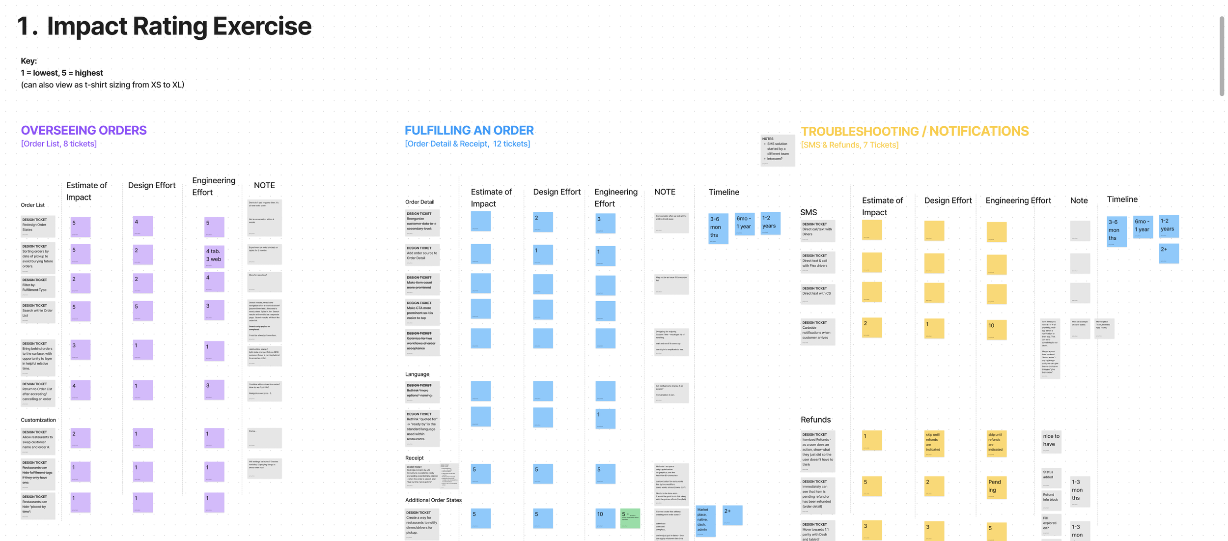
As I compiled the research and presented it to executives, I was also documenting user insights, creating actionable suggestions for when we scaled up the work that provide major impact to restaurants in their day to day operations.
I then compiled features I suggested based on the research, and guided the team through an exercise to discuss the level of effort vs. impact and set our team up for roadmap discussions and alignment.

The design system was updated recently