iConnect Access Mobile
iConnect is a universal image viewer. It is a product that traditionally did not have research. My goal was to create a web-mobile version of the existing software. I quickly discovered that we needed to understand who our users are and what their goals were.
Project Scope
End to end design
My Role
Sole designer
Duration
5 months
Business Need
The motivation for iConnect to have a mobile experience stemmed from two core business needs:
1. Business attrition from lack of desired mobile features
2. International market expectations
Research
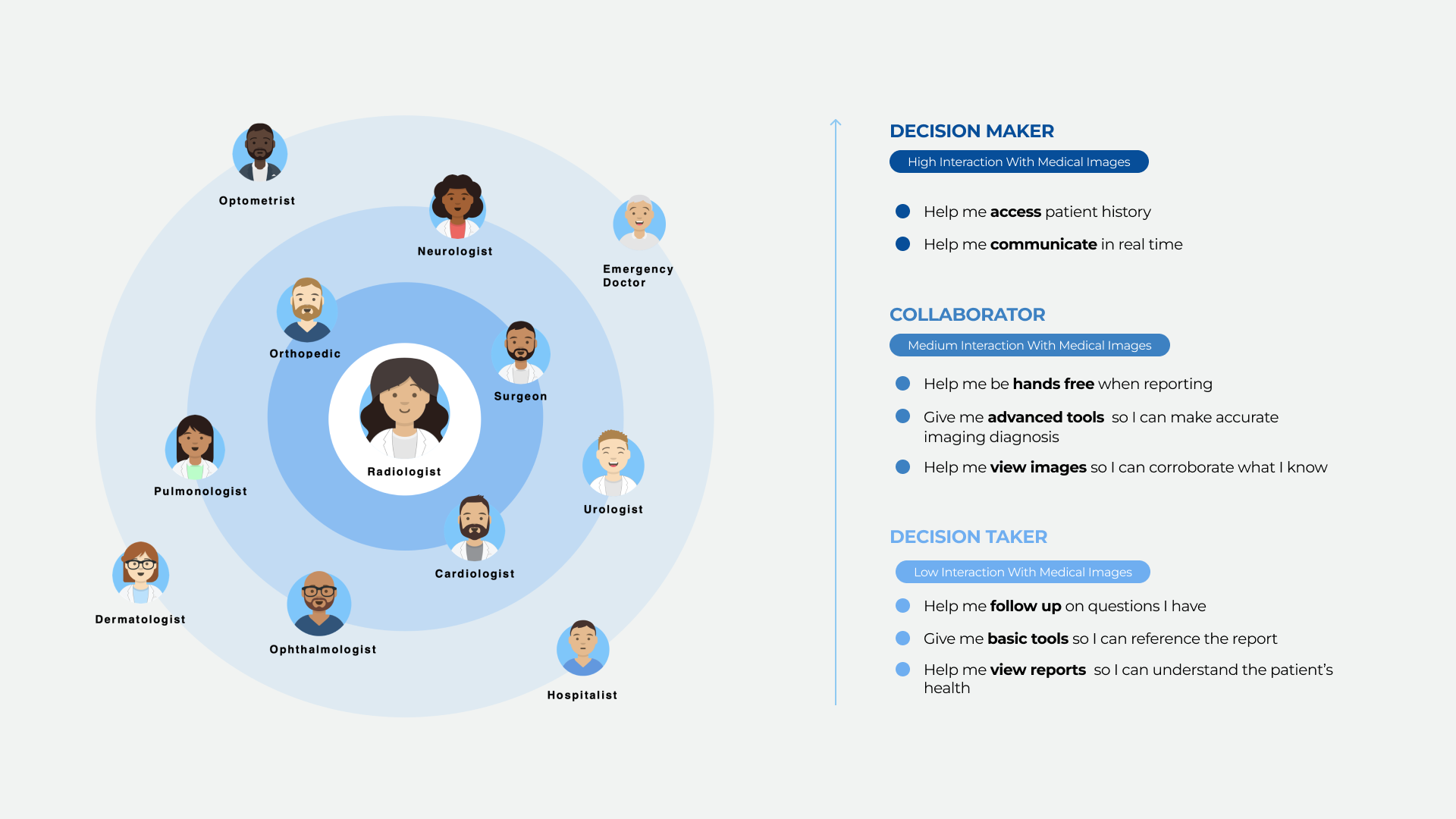
I prioritized 13 physician user types of the 20+ list of user types. I started by interviewing 2 of each user type.
After learning their goals and workflows I was able to bucket the users into “Decision Makers”, “Collaborators”, and “Decision Taker”, this helps me understand which design direction to take, as it made sense to emphasize the decision maker as they are the core users of the product.
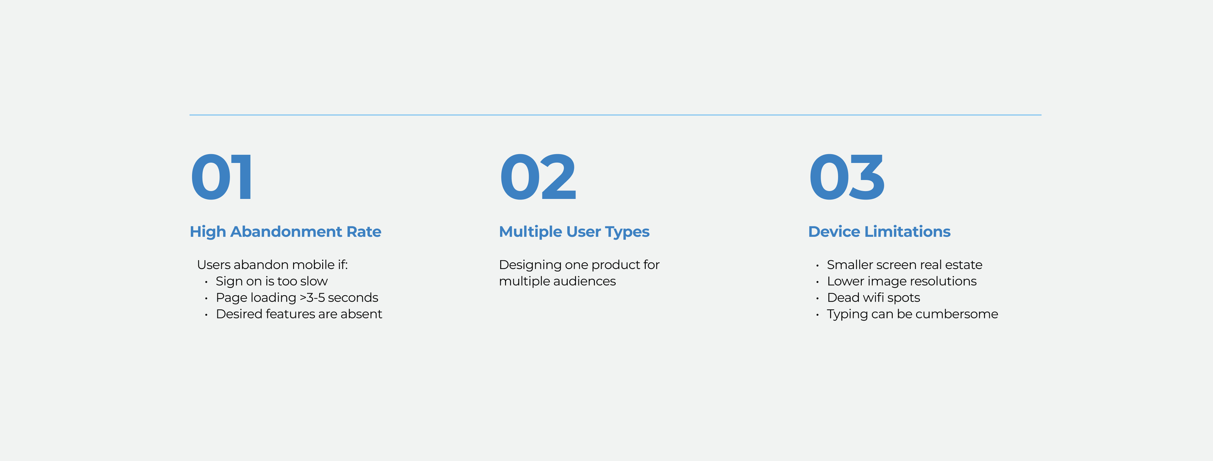
Challenges
Our product team lost partnership opportunities due to lack of mobile features. Users should be able to seamlessly go from desktop to mobile, and still have access to images, prior reports, and the same core tools.
Learnings
Through the interviews with users and stakeholders, I learned that what was working well and what need to change. I end up bringing back components and labels that were initially hidden to give more real estate, but as users use different multiple products a day, they needed navigation and tools always right in front of them to lessen confusion.
A strong theme throughout the entire product was having dictation and voice to text as users would have a difficult time typing information.
There was a strong desire to be able to use this as a tool as a unified platform to communicate to other physicians, leaving this as a good future opportunity.

Design Iterations
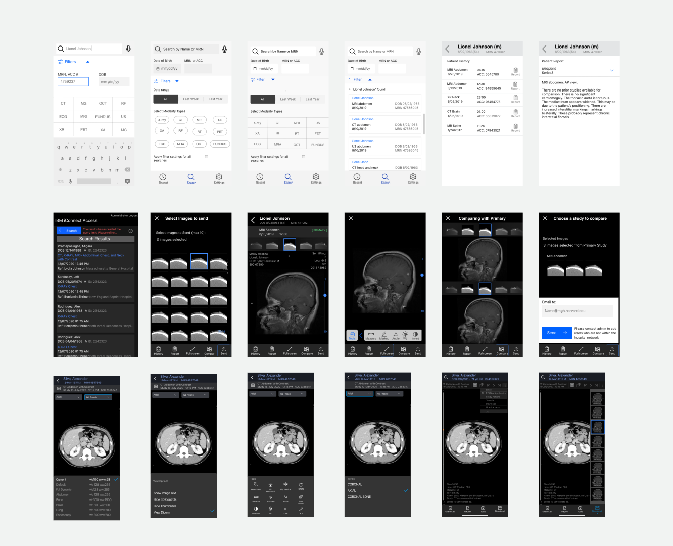
Users may first want to view report or images, depending on how experienced users are with reading images. Therefore, I created a flow that didn’t lock users into a specific path. I iterated through 50 different designs addressing flows, content, and tools for users and stakeholders to review.
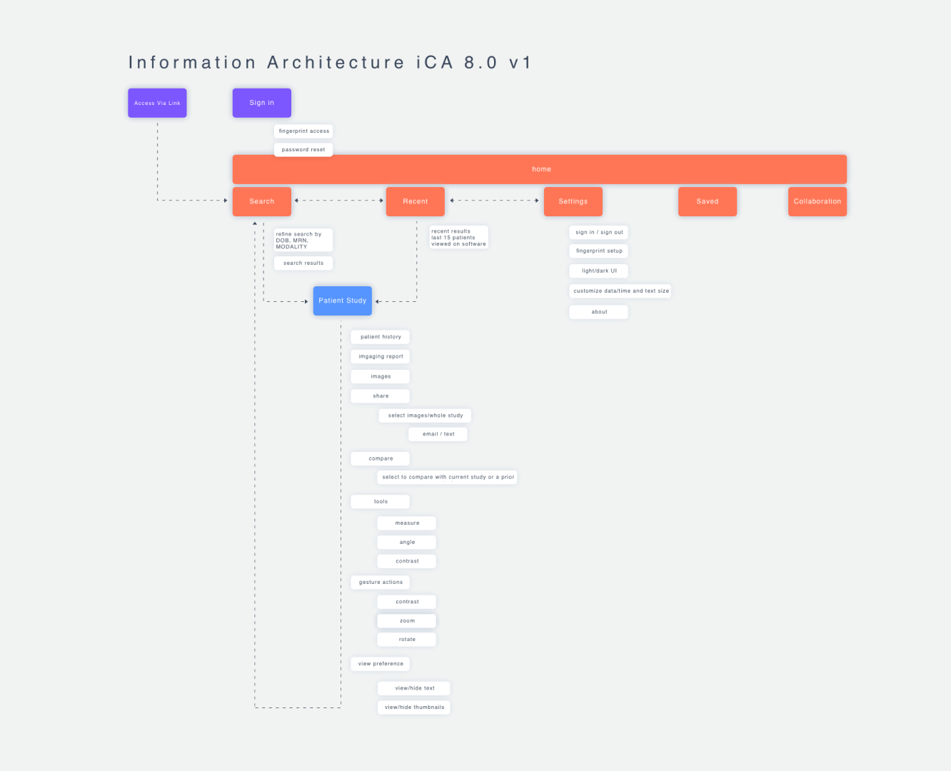
Information Architecture
I refined the flow from page to page to make sure the experience was to navigate and intuitive.
There was a tradeoff in staying consistent with the desktop product optimizing the experience for touch. I had to deviate from the desktop flow to accommodate for an intuitive mobile user experience.
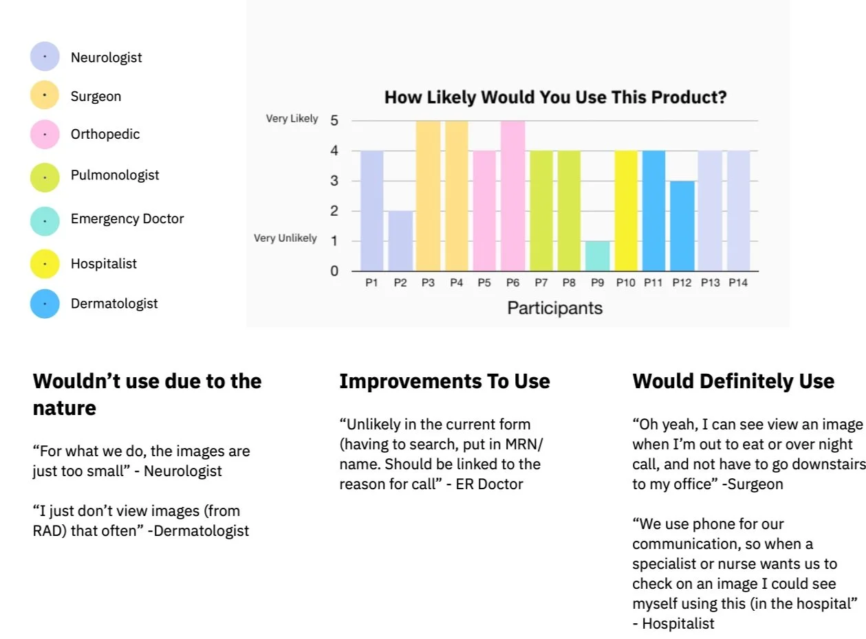
Usability Tests
Along the way I tested with the mobile experience different user types. The primary users of this product (the decision makers) found that this helpful. In the future, this product can be expanded with features to be more accommodating second and tertiary users.
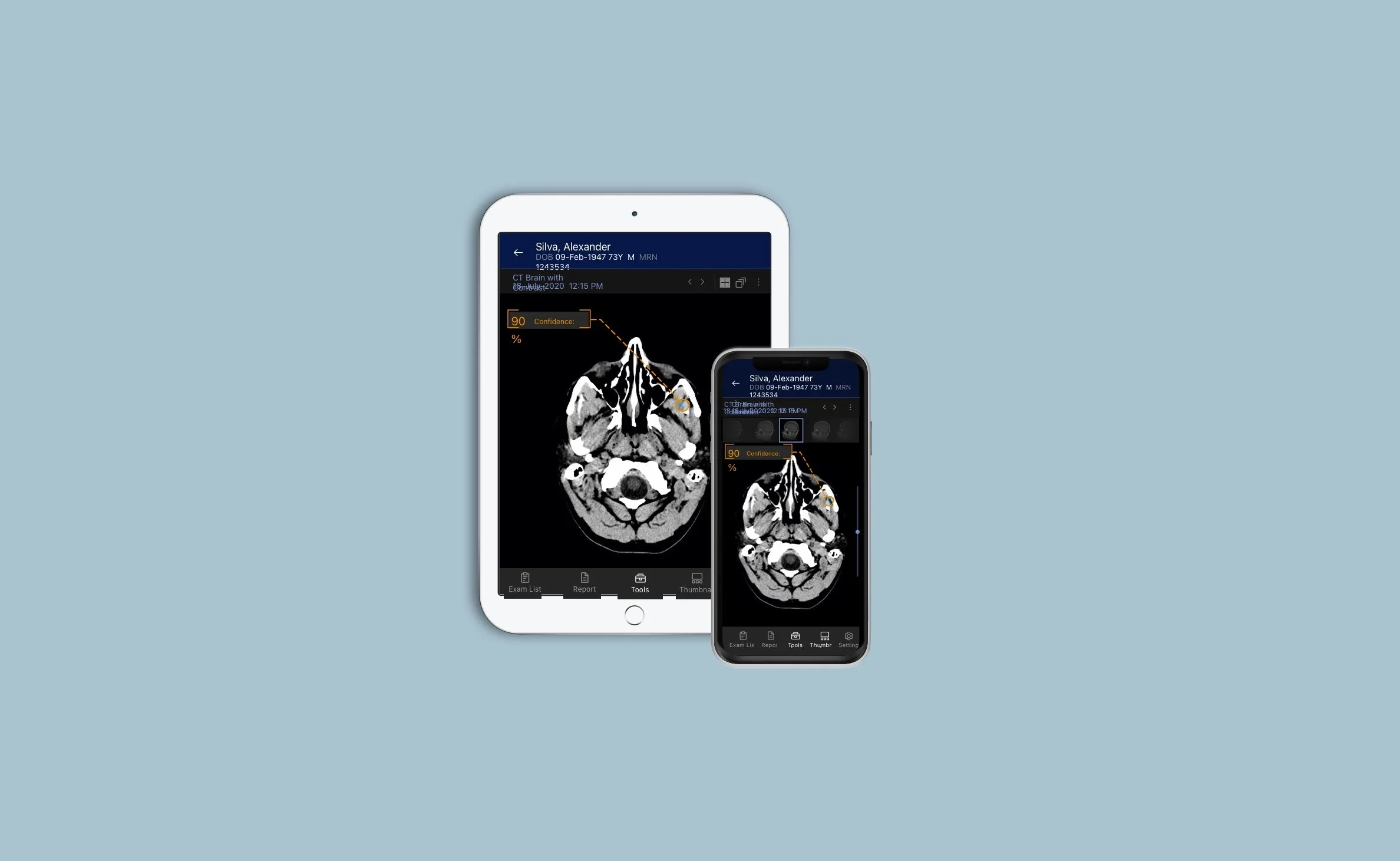
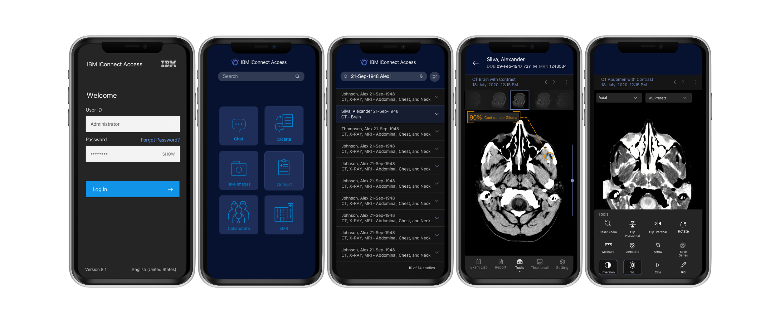
Final Designs
As the Carbon Design System did not have an official mobile pattern, I referenced Material Design, Apple’s Human Interface Guidelines as well as other mobile best practices. For this MVP, there were many constraints based on timeline and resources. In spite of this challenge, I created a long-term vision design along with developing the MVP version for production.
Impact
Customer Retention - 360,000 institutions & hospitals have access to images and reports from anywhere.