Reimaging IBM Watsons
Radiology Platform
An ambiguous 0-1 Project
01. Project Overview
Background
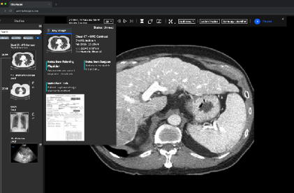
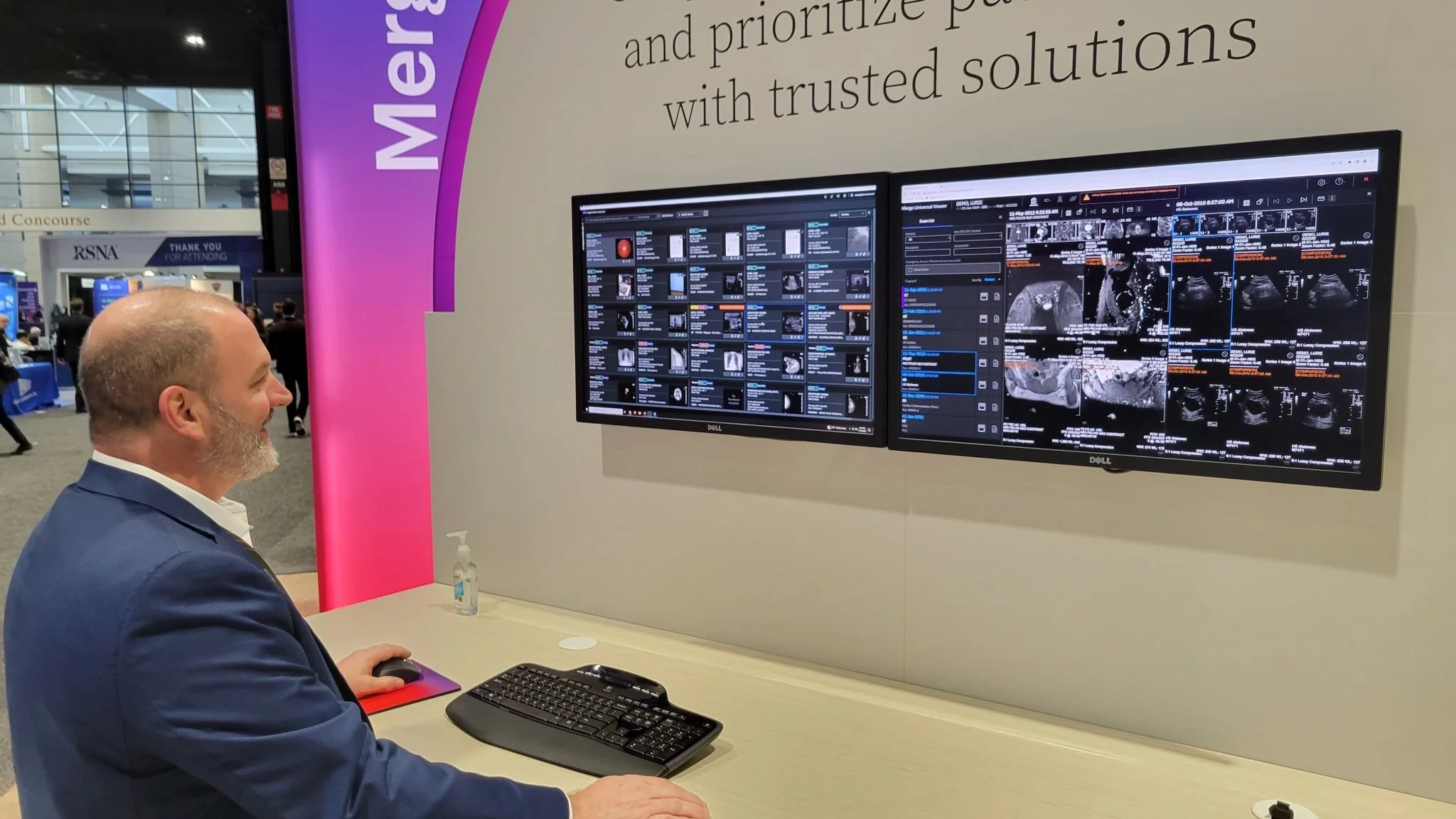
Workflow Orchestrator is a PACS (picture archiving system), that allows Radiologists to to view medical images. The company experienced customer attrition as there were no updates to the archaic and clunky experience. PACS is $1.27B market that grows at 4.5% annually, and we realized we not only had to redesign the product, but bring something innovative to the market. Working with our stakeholders, we sought to define the problem at hand.
Business Goal
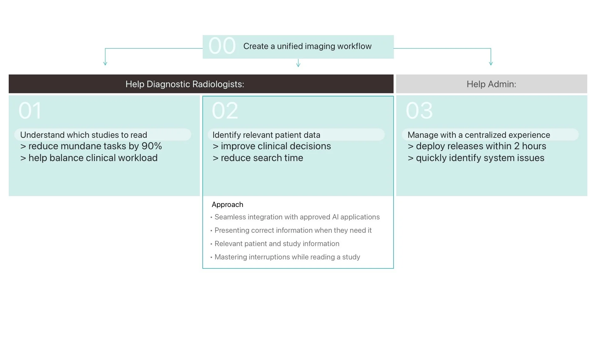
Improve the radiologists’s day to day experience to improve customer satisfaction and increase new customers.
Problem Statement
“How can we make a better experience for radiologists
and their team?
02. Who is our primary user? Where can we bring the most impact?
Identifying Users & Scope
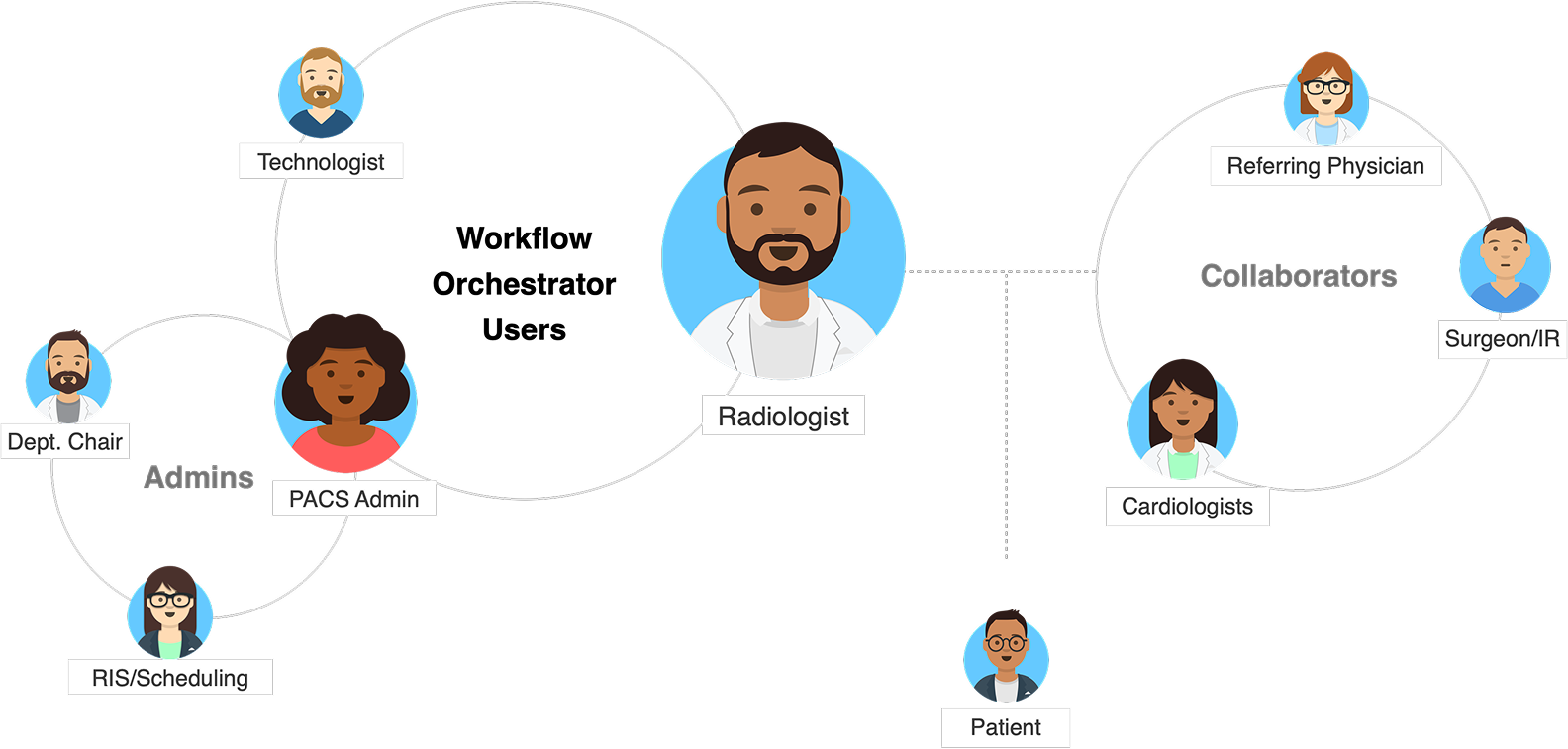
I spearheaded a remote design workshop to understand our design scope and align expectations. I simultaneously created relationships with a group of Radiologists and our onsite Radiologist subject matter expert. We decided our focus would be Radiologists and the PACS Admin (aka, a Radiologist’s personal IT person that helps to navigate the complex system).
Siloed Workflows, Foraging for Information, and Partnering with AI
Based on emerging themes from our workshop, we initially designed for as many concepts as possible. To begin narrowing down our concepts, I asked our developers determine feasibility and our product owners to determine desirability.
Siloed Workflows
Multiple products that were not interoperable.Foraging
Digging for and not being able to find relevant information.Partnering with AI
A past AI project would be included in this project. Many Radiologists acknowledged they would be replaced by, or have to work alongside AI, speculated how they might build trust with AI, and questioned liability.
Other themes: mental health, communication barriers, outdated point system (RVU), interruptions, and reporting.
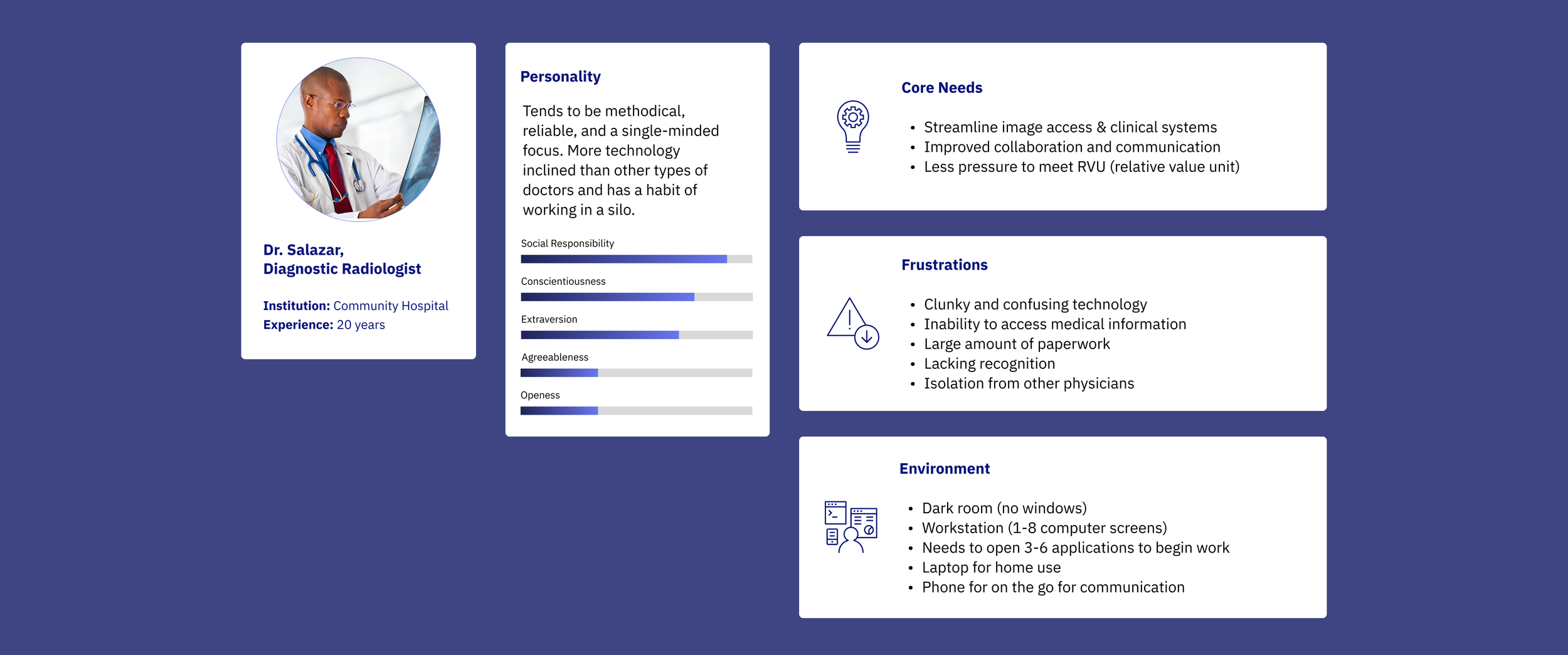
A Typical Diagnostic Radiologist
Radiologists are one of the most tech savvy doctor types, but also the most isolated due to the nature of their work. While they may talk to briefly to other doctors or a patient, most of their work is done by themselves in front of a computer.
Journey Map of a Radiologist’s Mental Model
Radiologists read about 300-400 studies a day. Deep diving into how they approach reading a study, gives key insight into the information we need to prioritize, and the type of experience they need. Traditionally, each touchpoint represents a different product.

Initial Ideation
To think big, there were no limitations. I ran bi-weekly sessions with a key radiology stakeholder to get his expertise as we came up with concepts, we started from wireframes and worked toward mid-fi.
Design Challenges
Challenge 1: Multiple screen orientations, resolution sizes, multiple monitors
Challenge 2: Multiple products that need to be combined into one screen
Challenge 3: The ability to seamless go from a patient screen to patient screen without losing placement
Iterations


Reframing the Problem
As we continued the iteration of research, design, and talking to stakeholders, we began to uncover the large issues that fit the user’s need and our business goals.
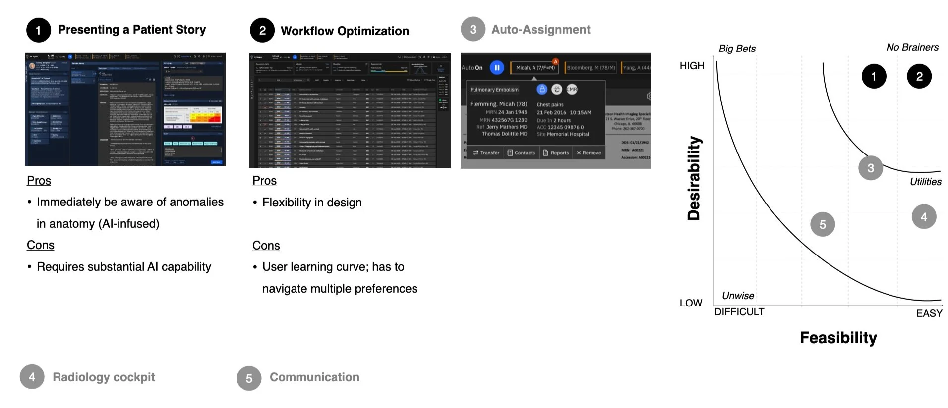
Prioritizing Ideas
We reduced our options down to 5 major design directions, and assessed trade-offs between feasibility and desirability for each design direction. Finally, we voted and settled on these two design direction that offered moderate-high feasibility that would yield the widest desirability for our users.
With stakeholders, we created blue-sky concepts and prioritized based on desirability and feasibility of 7 core concepts. I prototyped our final north star concept, assisted the product managers in tailoring a pitch to the executives.
Initial Ideation
To think big, there were no limitations. I ran bi-weekly sessions with a key radiology stakeholder to get his expertise as we came up with concepts, we started from wireframes and worked toward mid-fi.
Design Challenges
Challenge 1: Multiple screen orientations, resolution sizes, multiple monitors
Challenge 2: Multiple products that need to be combined into one screen
Challenge 3: The ability to seamless go from a patient screen to patient screen without losing placement
Iterations
Reframing the Problem
As we continued the iteration of research, design, and talking to stakeholders, we began to uncover the large issues that fit the user’s need and our business goals.
Prioritizing Ideas
We reduced our options down to 5 major design directions, and assessed trade-offs between feasibility and desirability for each design direction. Finally, we voted and settled on these two design direction that offered moderate-high feasibility that would yield the widest desirability for our users.
With stakeholders, we created blue-sky concepts and prioritized based on desirability and feasibility of 7 core concepts. I prototyped our final north star concept, assisted the product managers in tailoring a pitch to the executives.
Design Refinement
Patient Profile
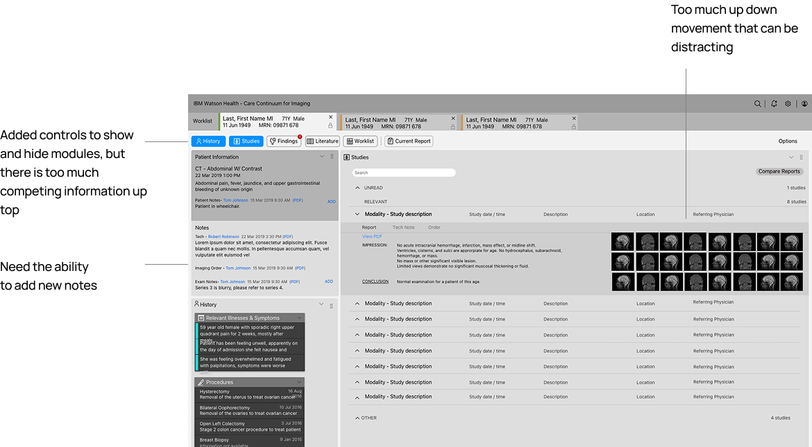
As we had three designers, each one of us took on a design objective. As I had experience working with patient data from prior projects, I took on the patient data page. through interviews, I learned what content for each section was the most important. Since this design has to work across multiple monitors and a landscape and portrait monitor, I decided to make each core section (patient info, notes, history, studies, findings, current report, literature, worklist) into components that could be moved around similar to a layout in adobe photoshop. Each layout can be customized for Radiology Speciality type.

Navigation
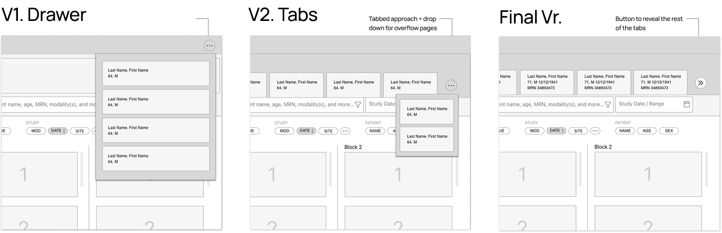
I created multiple navigation styles to navigate to and from the worklist to the patient page, the interaction here is really key and it needs to work on both one monitor and multiple monitors. The designers and I believed the tabbed navigation was the best for Radiologists, while product managers preferred the drawer dropdown as it provided a cleaner look. Since we could not reach a conclusion through conversation, so to speed up the decision making process, I proposed a usability test with 5 users testing both versions. All the 5 radiologists preferred the Tab version because they wanted to be aware of their studies open at all times.
For overflow, I did use a drawer. we didn't have this pattern existing in our design system, a developer told it would cost about $10,000 annually to maintain a year - and I decided that wasn't a good tradeoff for us. So I evolved the navigation the final version where you tap a button to see more. TABS: If multiple studies are opened, users wanted necessary identifiers to distinguish between exams, so we added their birthdate as well as their age and if they are female or male.
Final Design
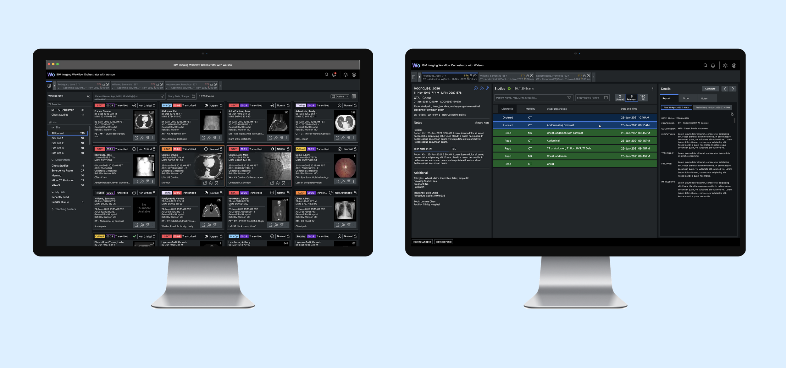
It’s very rare for a radiologist to only use one screen at their workstation, We also needed to make the design work in both landscape and portrait at the same time, and across 2-9 screens. Based on feedback, the worklist become the home screen and all patient screens would open on the secondary screen if they had one. We worked closely with developers to make sure this design would be responsive. I defined minimum widths and height of the modules by laying out the necessary information and testing it on both portrait and landscape layouts. The patient page all about one single pane of information that is being pulled from 3-4 different data sources, presented as one. How radiologists want to view data is highly preferential. To accommodate this, users can set up their own “workspace”. And can display as little or as much users as desired. While it can seem overwhelming to non-radiologists, radiologists like to see the data all laid out. In the future, we would like layouts to be laid out based on diagnosis type.

Outcome
Showcased at RSNA 2021, Workflow Orchestrator reduces software updates to 2 hours and reduce read time by up to 10%, which represents a $9M revenue opportunity.
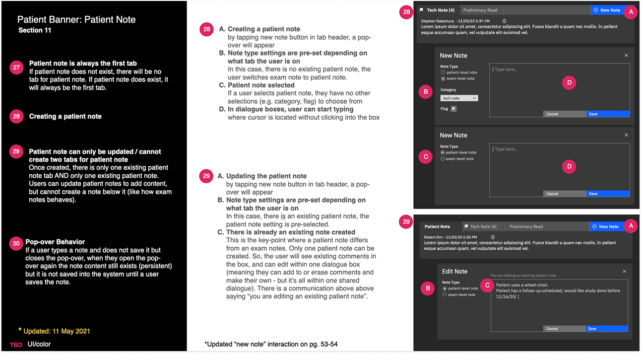
Communicating specs
As we had a hard dead line approaching as wanted to display a concept of the work at RSNA, a radiology conference, we needed to work fast; but we were still iterate the design and getting feedback from the team. There were about 15 developers working on this. We only worked closely with the front end developers so we need to communicate our designs very clearly, and this is an example of how I communicated interactions that happens when a user is creating a patient note within the patient page.
The Team
Product: James Thompson, Jenny Cheuk, C.R.,
Research: Katie Smiley, Jenny Cheuk
Frontend Engineers: Carlos Chiyoda, Jesse Martin
Backend Engineers: A team of about 30 engineers
Product Manager: Bill Kazee