ChowNow Orders (Dashboard)
Overview
ChowNow is a food ordering company that with a old dashboard page and a newer dashboard page that is in progress but contains many broken experiences. I joined the company to help modernize and connect the pieces on the dashboard team.
The Problem
Goal:
Business Challenge:
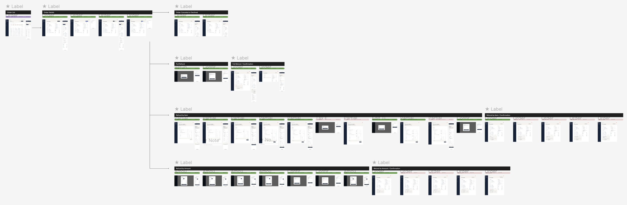
Information Architecture
After auditing the current information architecture and seeking to understand the current pages in our dashboard, I created an updated version of the IA.
Audit here.
Insert picture here.
Key pages of this product
Order list
Refunds
Orders
Post Order Adjustment
Orderlist
…
Refunds
Overview
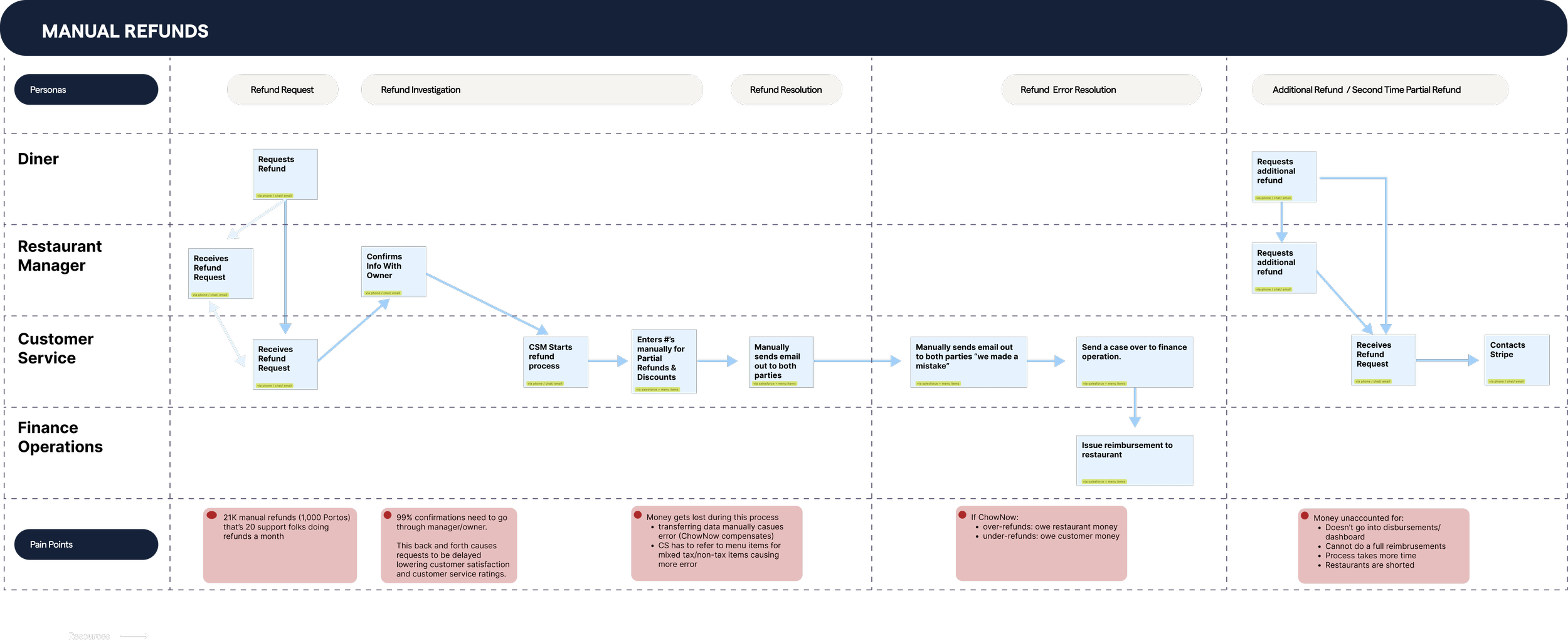
ChowNow only has refund ability on tablets and it has limitations. The tablet is usually busy for the front of house to process orders, so there is a need for a desktop and desktop mobile option.
Goal
Our goal is to create self-service experience on the tablet, desktop, and web-mobile would allow for a faster processing experience and increase customer retention.
The Problem
Through my research talking to our service representatives and engineers I immediately uncovered two core issues:
Problem 1/ lost time:
Currently when restaurants or diners want to conduct a refund, the restaurant either needs to use the tablet or call into Customer Service and enter rounds of phone tag. By providing a self-service experience on our desktop, this frees up time for Customer Service Reps and speeds up refund process from a few days to a few minutes.
Problem 2 / lost money:
Customer service is manually entering relevant data into Sales Force and pulling up sales tax from their restaurant page, then entering it into a calculator. Beyond the cumbersome experience of pulling up several products, they naturally make mistakes when typing up the numbers, leaving money on the table. Stream lining the refund process, automating calculations, and automatically applying state specific tax rulings would streamline and save the company money.
Design
Design Goal
Once an order is accepted, there are 4 different refund states: Full Refund, Refund by Item, Refund by Amount, and Canceled or Declined state. My goal is to create flows for these 4 different states and addressing each states individual needs using our new Design System. In areas where our design system was not created yet, I created the patterns and added it to our system. In addition, pages before and after the refund also needed to be created.
Refund by Amount
This refund state is for when a user wants to return by a certain amount and not by an item. The left modal shows what customer service ideally wanted, the ability to refund each line item in addition to a discount. However, that was too large of a calculation for this page and we planned to provide this option in our heftier refund option. I kept the breakdown of the line items to clearly communicate, and added a checkbox to easily include taxes, fees, and tips.
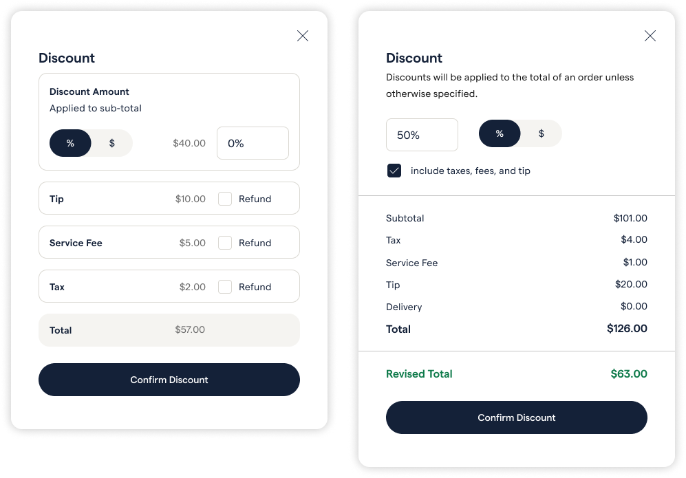
Discount wasn’t as accurate, so I changed the modal to say “Refund by Amount” to clearly communicate the function of this flow. There was an issue in the backend, where the checkbox cold not apply to the percentage amount, so I made small adjustments to the final modal and created error alternate versions as well as a confirmation modal to help restaurants manage refund records.

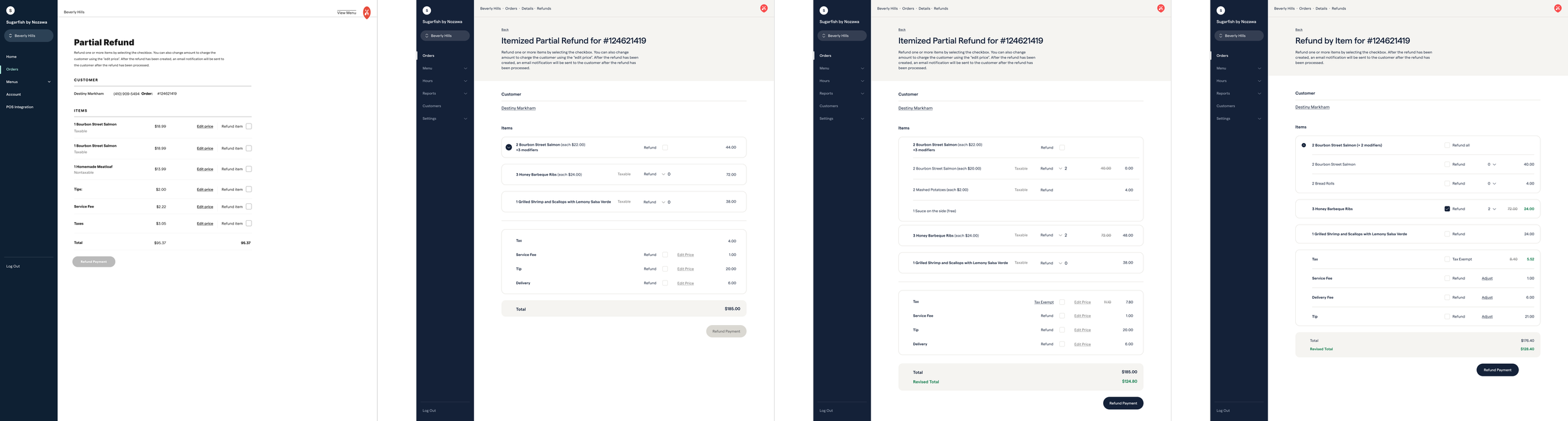
Refund by Item
This refund state allows users to refund items and also individual line items. When there are duplicate of items it can be confusing for restaurant staff, the cost amount can be confusing if it refers to the entire amount or just one item. So I wanted to make the cost of multiple items very clear, but played around with variations that also gave it a clean look. Based on feedback from reviews, I broke down grouped menu items as those are often returned individually. I placed grouped items into an accordion, as I observed a general theme of how having a overall view of the entire order helps restaurant staff (whether be refunds, orders, etc).
Disagreement & Resolution
I worked with an engineer who opposed adding so much detail to refund process. After a few conversations that did not end in a resolution, I invited him to one of my interview sessions with a very informed Customer Service Representative. After observing a session, he was on board not only with the design direction but also eventually became a design champion along side me.
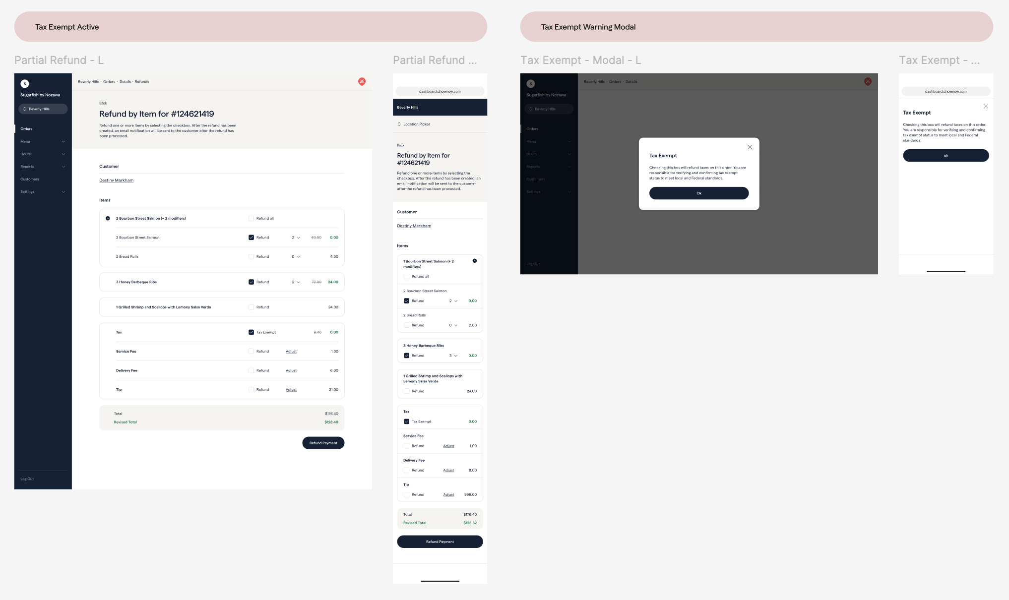
Alternate Tax Use Cases
As I was talking to Customer Service Representatives, I added two tax use cases. After thinking through a few ways to display this, I chose a simple check mark if this specific meal is tax exempt. As a team, we discussed that the restaurant would be responsible for checking these use-cases, but added a Tax Exempt Warning Modal that they are responsible. For restaurants that do not pay tax (0-tax restaurant), I made the entire line disabled. After discussing with our team, this would take additional backend support we did not have. I went ahead and added this to our future designs section. A few months later, we had a few restaurants asking about tax alternatives, and because I had the designs ready to go and vetted, we could implement this quickly for our clients.
Orders
…
Post Order Adjustment
…
Connecting the Experience
…