ChowNow Dashboard
estaurant operators juggle order management, financial reporting, and customer service across fragmented systems, spending 15-20% of their time on administrative tasks. With ChowNow's 22K+ restaurants, dashboard inefficiencies compound into millions of hours of lost productivity annually. Our challenge: redesign four critical workflow areas—reporting, order management, refunds, and [fourth area]—into a cohesive experience that reduces operational friction while providing actionable business insights.
Project Scope
End to end project
My Role
UX and research, working in tandem with our systems design lead.
Duration
Multiple projects over 2 years
Unified Research Section:
One research methodology covering all areas
Shared user personas and pain points
Cross-cutting insights that informed all features
2. FEATURE-SPECIFIC SECTIONS (400-500 words each)
Template for Each Sub-Project:
[Feature Name]: Problem → Solution → Impact
Problem (100 words):
Specific user pain point for this feature
Current workflow inefficiencies
Business impact of the problem
Solution (250 words):
Design approach and key decisions
Unique challenges for this feature area
Cross-functional collaboration specifics
User testing insights
Design Rationale (100 words):
Why this approach vs. alternatives
Technical constraints and solutions
Integration with other dashboard areas
Impact (50 words):
Feature-specific outcomes
User feedback highlights
3. DETAILED BREAKDOWN BY FEATURE
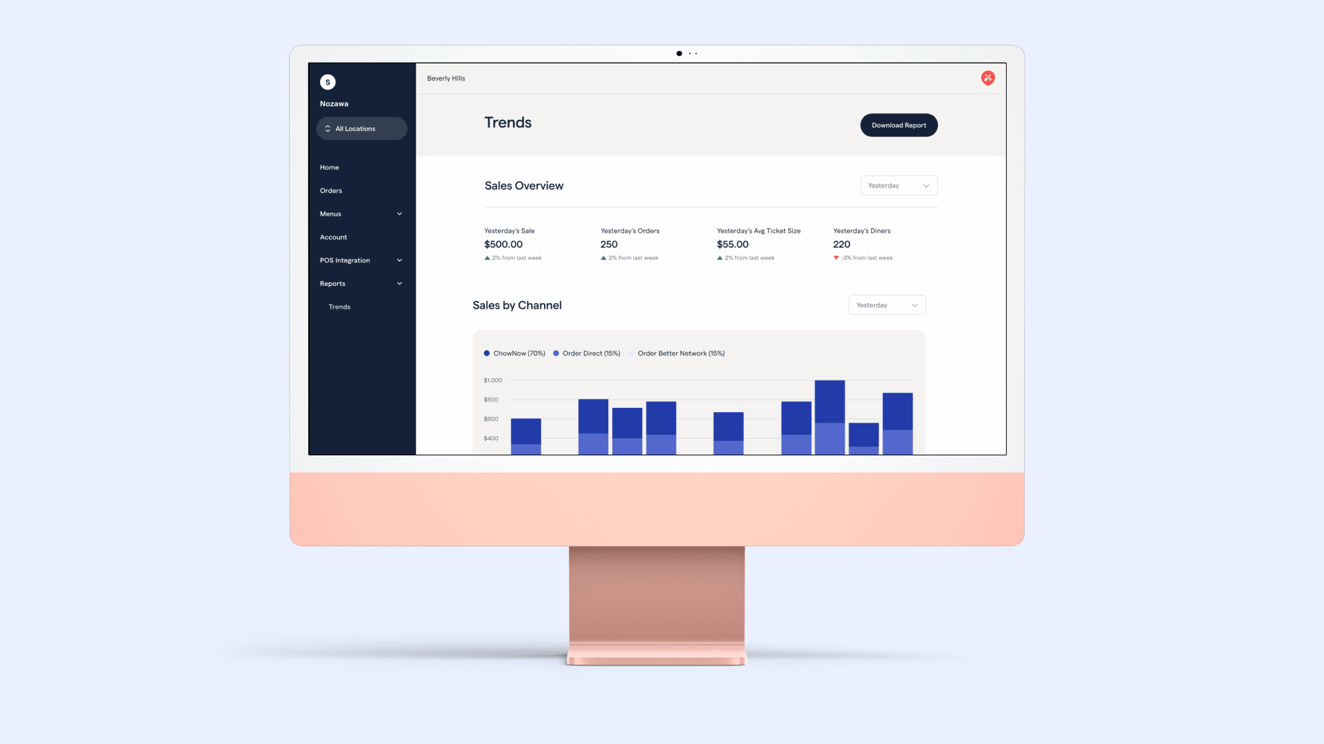
Feature 1: Reporting Dashboard
Focus Areas:
Data visualization strategy
Customizable metrics selection
Mobile vs. desktop experience
Real-time vs. historical reporting
Feature 2: Order Management
Focus Areas:
Order status workflow design
Bulk actions and efficiency
Real-time updates system
Integration with tablet experience
Feature 3: Refunds Process
Focus Areas:
Simplified refund workflow
Error prevention design
Customer communication automation
Staff permission management
Feature 4: [Your Fourth Area]
Focus Areas:
[To be defined based on your work]
4. CONTENT EFFICIENCY STRATEGIES
Avoid Repetition:
Instead of: Repeating user research for each feature Do: Reference shared research with feature-specific insights
Example:
"Building on our foundational research with 15 restaurant managers, the refunds process emerged as a critical pain point, with 73% reporting weekly frustration with the current system."
Cross-Reference Features:
Example:
"The order management redesign needed to seamlessly integrate with our refunds process (detailed below) to prevent data inconsistencies that plagued the previous system."
5. VISUAL ORGANIZATION
Navigation Strategy:
📊 Dashboard Overview
   ├── 📈 Reporting Dashboard
   ├── 📋 Order Management
   ├── 💰 Refunds Process
   ├── ⚙️ [Fourth Feature]
   └── 📊 Unified Impact
7. SENIOR-LEVEL DIFFERENTIATION
Show Systems Thinking:
"Designing these four features required careful consideration of data flow, user mental models, and technical constraints. Changes to the refunds process, for example, needed to update order statuses, trigger reporting calculations, and sync with the tablet experience."
Demonstrate Leadership:
"I facilitated weekly design reviews with stakeholders across all four feature areas, ensuring consistency while respecting each area's unique requirements."
🚀 IMPLEMENTATION APPROACH
Week 1: Content Audit
Document what you remember about each feature
Gather any existing screenshots, notes, or metrics
Identify shared vs. unique aspects
Week 2: Feature Prioritization
Choose your strongest 3-4 sub-projects
Focus on areas with clearest business impact
Ensure variety in problem types shown
Week 3: Content Creation
Write shared sections first (opening, research)
Develop each feature section using the template
Connect features to show systems thinking
ChowNow Dashboard: Senior-Level Case Study Development Plan
📋 REQUIRED CONTENT OUTLINE
1. STRATEGIC OPENING (150-200 words)
Framework:
Market Context + User Problem + Business Stakes + Your Solution ApproachContent Needed:
Restaurant management software market size/trends
Time restaurant owners spend on administrative tasks
Cost of operational inefficiency to restaurants
ChowNow's competitive positioning in restaurant tools
Example Structure:
"Restaurant owners spend 15-20% of their time on administrative tasks instead of customer service and business growth. With the restaurant management software market growing at 8.9% annually toward $7.2B, operators demand integrated solutions that consolidate order management, reporting, and financial operations. ChowNow's 22K+ restaurants needed a unified dashboard that would reduce administrative burden while providing actionable business insights to compete with all-in-one platforms like Toast and Square."
2. PROBLEM DEFINITION (200-300 words)
Research You Need to Document:
User Pain Points:
How much time do restaurant managers spend switching between systems?
What reports do they generate manually that could be automated?
How often do refund processes cause customer service issues?
What business decisions do they struggle to make without data?
Business Problem:
Customer complaints about dashboard complexity
Support ticket volume related to reporting/refunds
Competitive disadvantage vs. integrated platforms
Churn risk from frustrated restaurant owners
Content Structure:
Current State → Pain Points → Business Impact → Opportunity3. RESEARCH & DISCOVERY (300-400 words)
Document These Activities:
User Research:
Restaurant owner/manager interviews (how many?)
Workflow shadowing/observation sessions
Current state journey mapping
Pain point prioritization exercises
Stakeholder Research:
Customer success team insights
Support ticket analysis
Sales team feedback on competitive disadvantages
Executive alignment on dashboard priorities
Competitive Analysis:
Toast, Square, Resy dashboard comparisons
Feature gap analysis
Best practices identification
Content to Include:
Research methodology and participant details
Key insights with supporting quotes
How insights influenced design priorities
Stakeholder alignment process
4. DESIGN STRATEGY & PROCESS (400-500 words)
Document Your Approach:
Information Architecture:
How did you organize reporting, orders, and refunds logically?
Card sorting or tree testing results
Navigation structure decisions
Design Principles:
What guided your design decisions?
How did you balance power users vs. occasional users?
Mobile-first vs. desktop-first approach
Cross-functional Collaboration:
How did you work with the systems design lead?
Engineering constraint discussions
Product manager alignment on priorities
Iteration Process:
Initial concepts and stakeholder feedback
User testing methodology and findings
How feedback shaped final designs
Content Structure:
Design Principles → IA Decisions → Collaboration Process → Iteration Cycles5. KEY FEATURES & SOLUTIONS (500-600 words)
For Each Area (Reporting, Orders, Refunds):
Reporting Dashboard:
What metrics matter most to restaurant owners?
How did you make complex data digestible?
Customization capabilities and rationale
Mobile vs. desktop considerations
Order Management:
Workflow improvements over previous system
Real-time updates and notification strategy
Bulk actions and efficiency features
Integration with tablet experience
Refunds Process:
Current vs. improved refund workflow
Error prevention and validation
Customer communication improvements
Staff training considerations
Cross-cutting Features:
Nested modifiers: Technical complexity and UX solutions
Post-order adjustments: Business rules and user experience
Tablet adaptation: Design system consistency
Content Structure for Each:
User Need → Design Challenge → Solution Rationale → Implementation Details6. OUTCOMES & IMPACT (200-300 words)
Metrics to Document:
User Experience:
Time savings per restaurant (before/after)
User satisfaction scores or NPS improvement
Support ticket reduction in dashboard-related issues
User adoption rates of new features
Business Impact:
Customer retention improvements
Reduced customer success team workload
Competitive advantage in sales conversations
Revenue impact (if available)
Qualitative Feedback:
Restaurant owner testimonials
Customer success team feedback
Internal stakeholder satisfaction
Content Structure:
User Metrics → Business Metrics → Qualitative Feedback → Future Opportunities7. LEARNINGS & REFLECTION (150-200 words)
Professional Growth Documentation:
What did you learn about restaurant operations?
How did this project change your design approach?
What would you do differently next time?
How did you grow as a cross-functional collaborator?
🎯 IMMEDIATE ACTION PLAN
Phase 1: Content Gathering (Week 1)
Collect user research notes and recordings
Gather business metrics and outcomes data
Screenshot current vs. old dashboard states
Interview customer success/sales teams for impact stories
Phase 2: Content Creation (Week 2)
Write strategic opening using market research
Document research methodology and findings
Explain design rationale for each feature area
Quantify outcomes and impact
Phase 3: Visual Enhancement (Week 3)
Create before/after workflow diagrams
Design process flow visualizations
Include user feedback quotes prominently
Add metrics visualizations
Estimated Total Content: 2,000-2,500 words
Would you like me to help you develop any specific section of this outline?